From Angry Bear:
It’s always the same map.
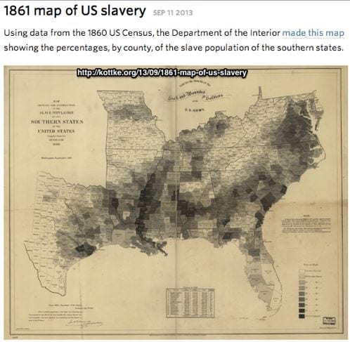
Here from Brad Delong is the map of the percentage who were slave by county in 1861
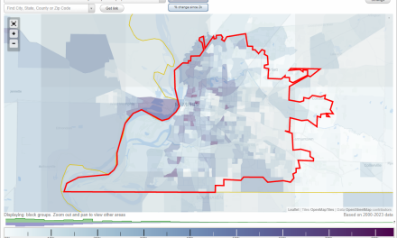
here is the corresponding area of a map of intergenerational relative income mobility by county from R Chetty 2014
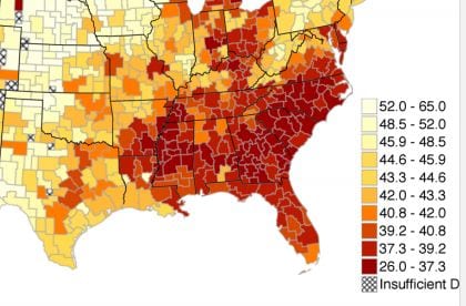
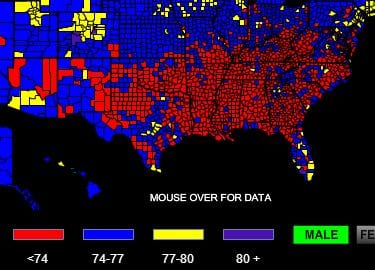
Here is a map of male life expectancy at birth
It’s not past yet.
(You see this pattern a lot in maps of various social and economic indicators. Poverty :