From Atlantic Cities:
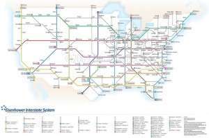
A month ago the Wire spotted an incredibly intricate rendering of American highways, drawn in the style of a subway map. The work was done by graphic designer Cameron Booth, a Sydney, Australia, native who moved to Portland in 2007. Booth says transit maps are “definitely a passion of mine.”
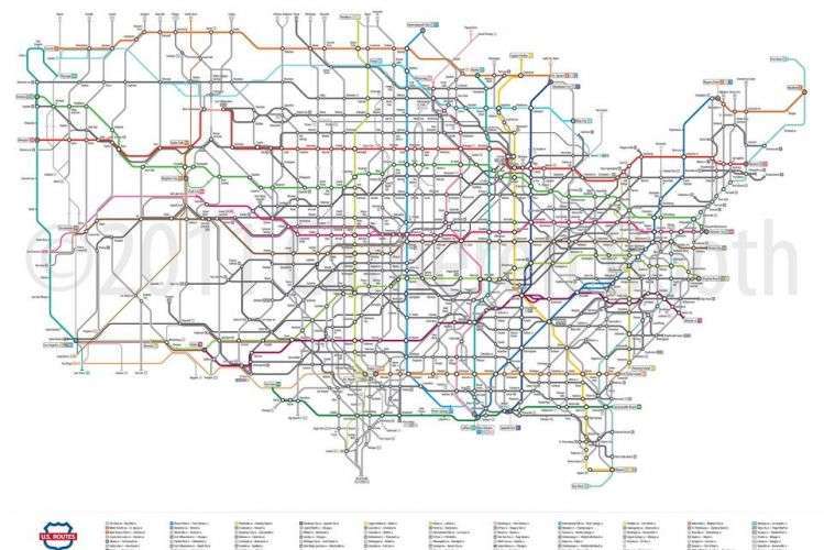
In addition to his day job providing transportation infrastructure designs for Parsons Brinckerhoff, he runs a blog devoted to transit map design. Inspired by the beauty of the London Tube map, Booth completed a metro-style look at the Interstate Highway System in 2009. The map’s popularity – it’s been viewed nearly 100,000 times on Flickr and included in a book – led to the completion of an even more impressive feat in late 2011: a map of the entire U.S. Highways system.
Atlantic Cities caught up with Booth to discuss the challenge of imposing one form of transportation on the map of another. City-minded viewers of Booth’s work may be confused by some of his scaling. On the interstate map, for instance, the dot marking the city of Dayton, Ohio, is noticeably larger than that of New York City (see the third image in the gallery below). That’s because Booth’s transit-style maps favor major road connections over population or importance.
“Some people have a lot of trouble with this interpretation of a once-familiar road network,” Booth says.
You originally drew the “Interstates as Subway” map back in 2009 — presumably in your free time. What in the world inspired you to do that?
Back in 2009, I ran across quite a few “simplified” renderings of the Interstate system on the Internet — all of which were interesting and very different from each other. Some other commenters were calling these “subway-style” maps, but to my mind, none of them captured the essence of the best transit diagrams. They didn’t use different colors for different “lines,” or show clearly differentiated “transfer stations,” for example. So, taking my design cues from the Tube Map, I set about designing my own vision of the Interstate system. The original version probably took me around 80 to 100 hours of work in Adobe Illustrator (spread over the course of a few months), using Wikipedia and Google Maps as my main sources of information.
Why import a British design for an American highway system?
The Tube Map is a truly iconic piece of information design. These days, with the transit diagram an almost ubiquitous design form, it can be difficult to realize exactly how revolutionary the visual approach taken by the Tube Map was in the 1930s when it was first designed by Harry Beck: thick, brightly-colored, starkly angled route lines with geography reduced to the barest elements.
The diagram emphasized connections and station sequencing over geographical reality and helped make visual sense of a vast and chaotic transportation network.
Originally only grudgingly released by the London Underground as an experimental pamphlet in 1933, Londoners quickly embraced the Tube Map as their own and it now stands as an instantly recognizable symbol of their city, even with all the changes it has undergone throughout the years. In a way, my design is a tribute or a homage to that pioneering work. Very few U.S. transit maps come close to the beautifully clean design of the Tube Map (New York having discarded the diagrammatic look after Massimo Vignelli’s map of the 1970s), so it just seemed the most appropriate choice.
In early 2011 you completed an updated version of the map to correct what you call “poor design choices and sloppy technique.” To the untrained eye things look pretty much the same. Can you explain what you mean by this, and how you improved some of those choices/techniques?
My first attempt certainly doesn’t look bad, it’s more a case of me learning new skills in the intervening two years and applying them to the newer version. I definitely blustered my way through the first one — there’s only a very rudimentary underlying grid and I eyeballed the placement of quite a few elements rather than using the precise tools available to me in Adobe Illustrator. Everything in the second version has its position determined by a grid and mathematical placement of points.
I was more confident in my design choices the second time around and this allowed me to add extra detail without sacrificing the clean, open look of the original. Examples of this are showing the east-west splits in I-35 in Dallas/Fort Worth and the Twin Cities in Minnesota — something I didn’t even attempt in the first version [see the gallery for these details]. These splits are the only ones in the entire Interstate system, so I thought it was definitely worth showing them in all their idiosyncratic glory.
In December you released a new map: this one of the U.S. Highways. That system is much more extensive than the interstate system. What were the some of the challenges you faced drawing this map that you didn’t face in the earlier one?
A lot more roads! While there are a lot of missing numbers in the Interstate system, almost every number between 1 and 101 is used for the (older) U.S. Highways System. And a lot of these routes are long — stretching from border to border in many cases. You might think that would make the network more gridlike and easier to work with, but in a lot of places, the roads twist around and cross over each other — things start getting really confusing. There are some cities where a lot of highways converge and these were the most problematic. I also decided to show decommissioned historical routings of highways (the thin lines on the map) and these took a lot of research (and time!) to get exactly right.
You write on your site that as a result of these challenges the U.S. Highways map took you more than a year to complete, and at various points you were convinced it was impossible to do.
The biggest frustration was getting started and creating a convincing scale for the map that was going to work across the entire map. I always like to start the map at the most difficult point and work my way outwards from there: in this case, that was Memphis, Tennessee. Off the top of my head, there are seven or eight U.S. Highways that pass through there, some of which cross the Mississippi River to West Memphis. It’s a ridiculously complex intersection, so simplifying it down to a nationwide scale while still retaining some idea of how the roads interact with each other was a tough problem to solve.
Your maps have a clean quality that stands in contrast to the messy design of typical road maps. What are some of the stylistic differences you see between road maps and transit maps, and how do you account for them?
In my opinion, transit maps should really only have one purpose: telling passengers where to get on and off. Transit maps are about connections, not the geographical actuality of the routes. Get on here, change trains here, get off here — shown in a form that’s quick and easy to read intuitively. Road maps, on the other hand, are all about geography — they show every twist and turn of the road, every exit and interchange, accurate distances, points of interest and more. They’re meant for serious, detailed perusal, and give you the accuracy you need to actually navigate along the road system to your destination. Anyone who tries to take a road trip using my maps is going to get lost at the first exit, but that’s not what it’s for!
Highway and transit interest groups don’t always get along. Are we being too bold to view your maps as a suggestion that these two groups put aside their differences and work together?
The original Interstate map was definitely a comment on America’s love affair with the automobile. In a way, the Interstates are our transit system. The car is definitely here to stay, but there needs to be room (and funding!) for transit as our population increases and ages. It’s simply not sustainable to continue building ever-wider highways: there has to be alternative ways to move people around.
This may be like asking to choose a favorite child, but is there a segment of your maps think is particularly well crafted?
A lot of the time, it’s the little things that make me happiest. On the Interstate map, I’m particularly proud of the roads from Wisconsin through Chicago and up into Michigan. It’s a complex area, but it just looks really clean and well-designed. I also really like I-26 from Kingsport, Tennessee, to Charleston, South Carolina — it’s a dead straight line from one end to the other, yet fits into the network around it really well [see the gallery for this detail].
Below, a slideshow of some of the most interesting portions of the map. All images courtesy of Cameron Booth. Images are available for purchase here.


Fun!